The Brief
Mopao, a DJ and producer crafting what he defines as « afro club » — a new, contemporary genre — approached me to create a brand identity that would honor his desire to reconnect with his African roots while maintaining a resolutely modern aesthetic. The challenge was to develop a visual language that would bridge Bantu heritage, particularly the Luba people, with the cutting-edge sound of contemporary electronic music, avoiding any caricatural African folklore aesthetic.
The Creative Process
Cultural Research & Visual Language
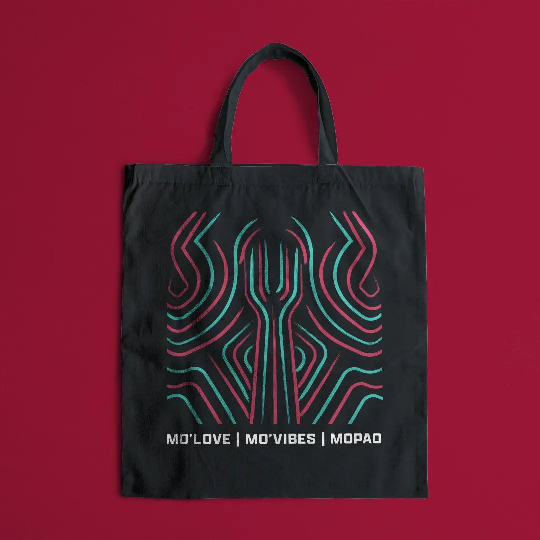
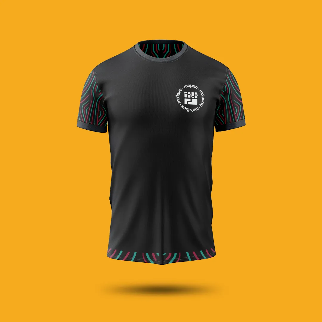
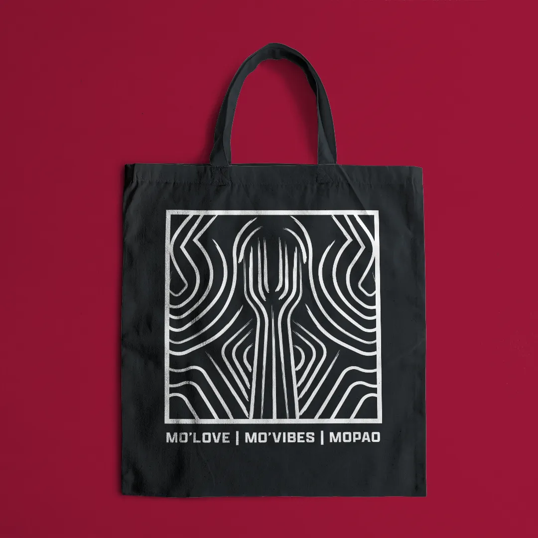
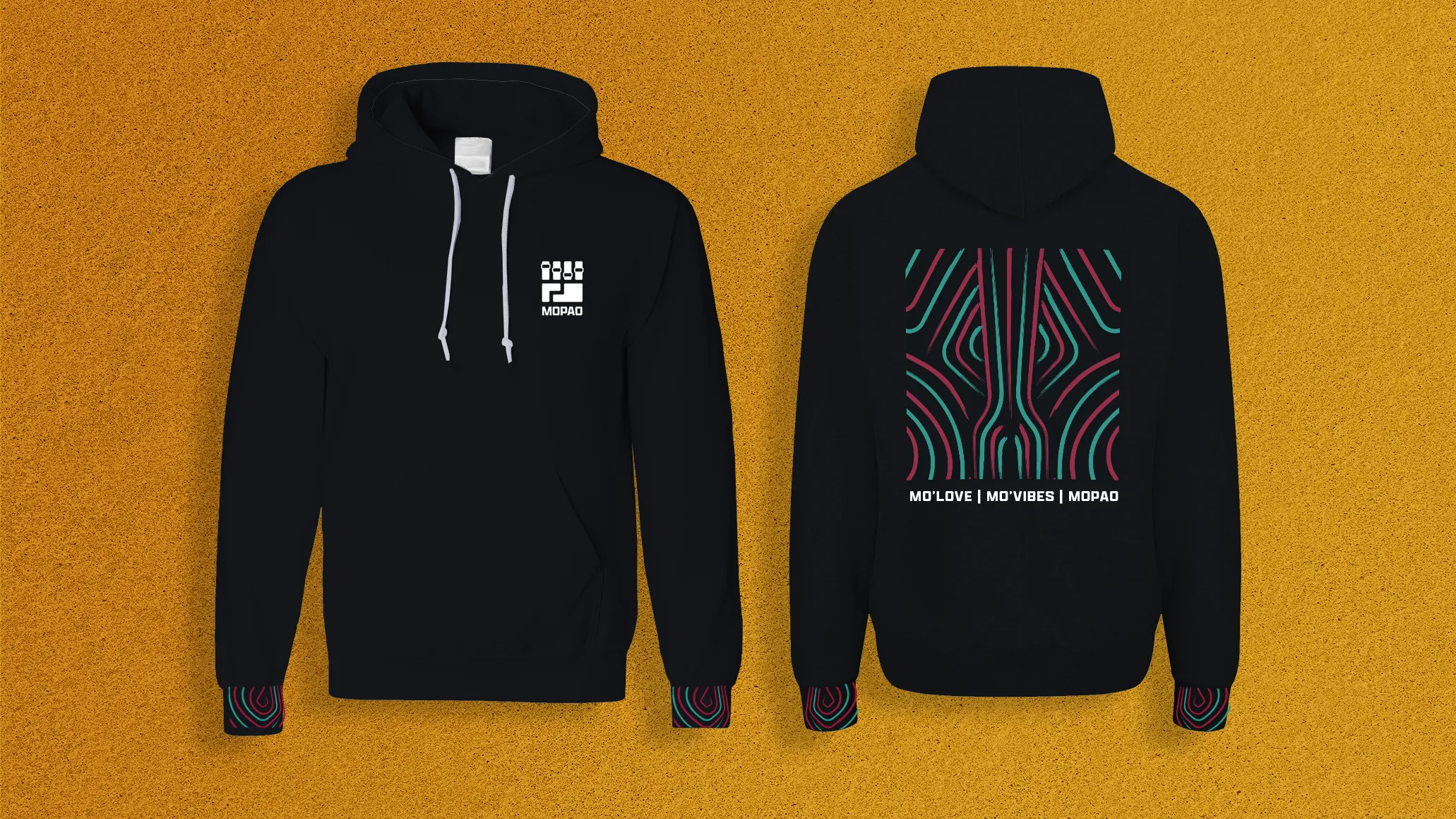
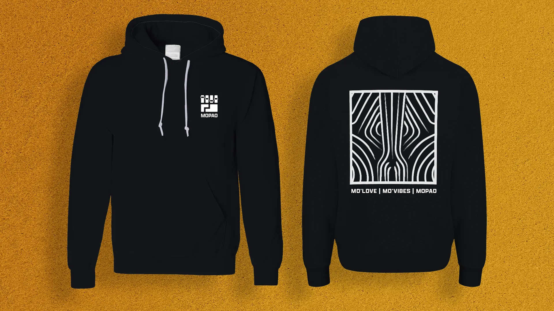
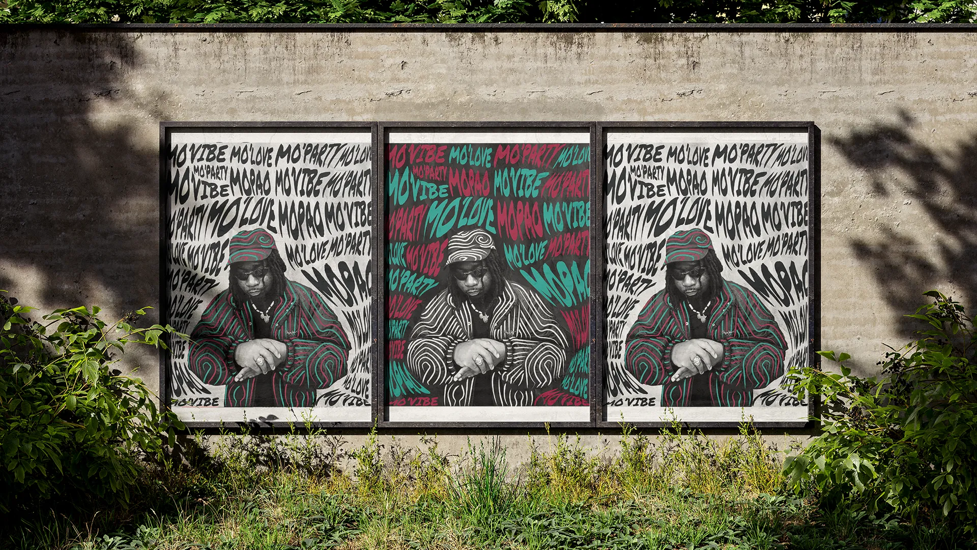
For this branding project, I followed Mopao’s vision of reconnecting with his roots by subtly integrating references to Bantu tribes, particularly the Luba people. Since the Luba transmitted their knowledge primarily through oral tradition rather than written records, I had to move away from conventional iconographic sources like writing or painting. Instead, I drew inspiration from scarification patterns and ceremonial masks — visual forms that carried deep cultural meaning within Luba society.
I deliberately maintained a modern edge to avoid falling into stereotypical African imagery, ensuring the identity remained aligned with Mopao’s musical style — afro club is a new, contemporary genre, distinct from traditional music forms.
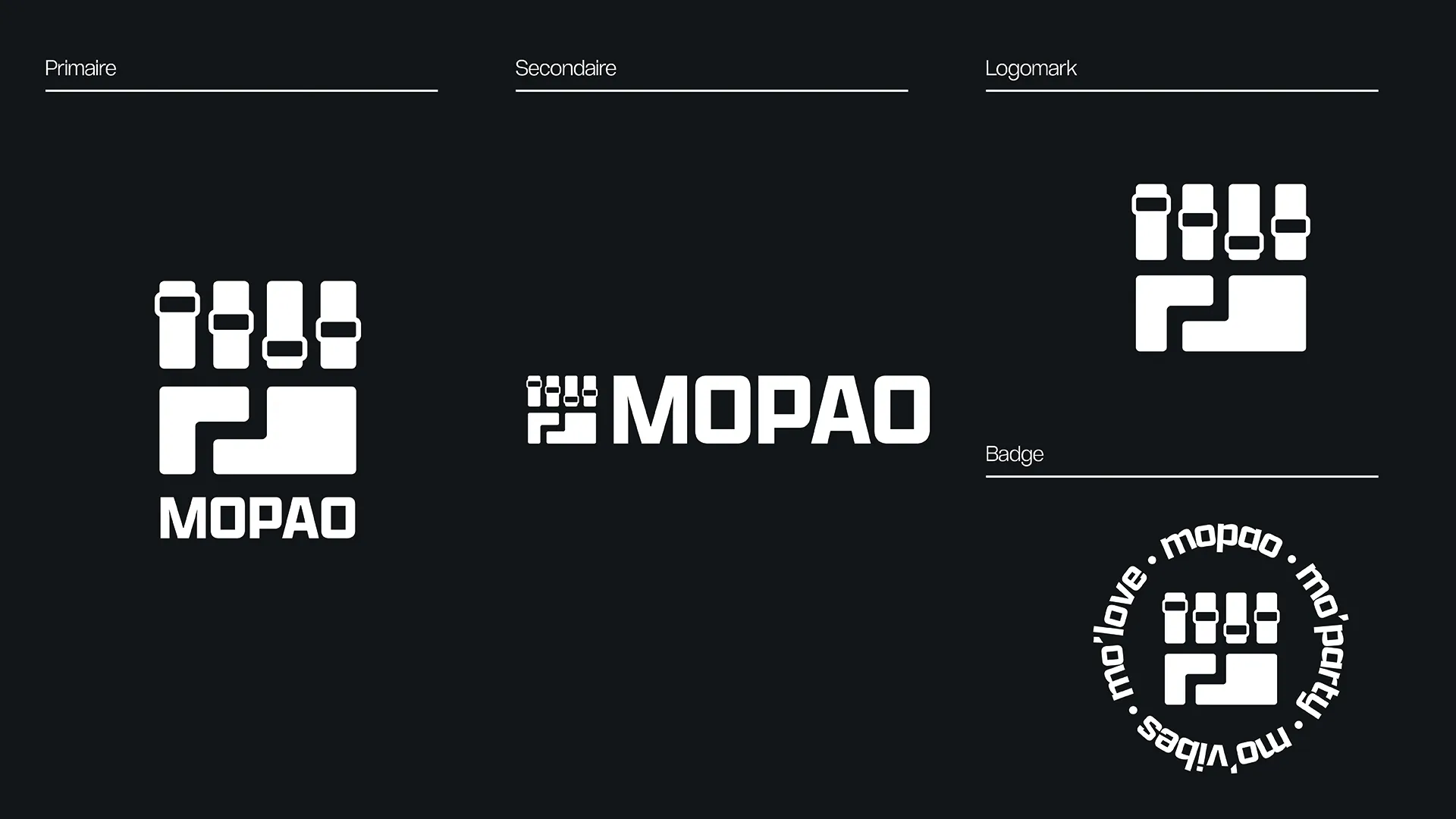
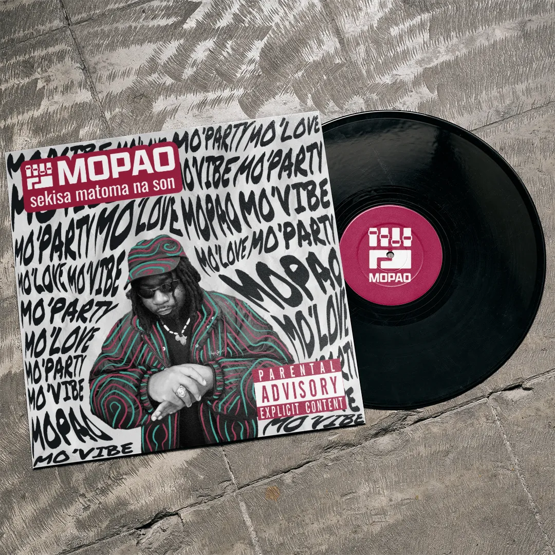
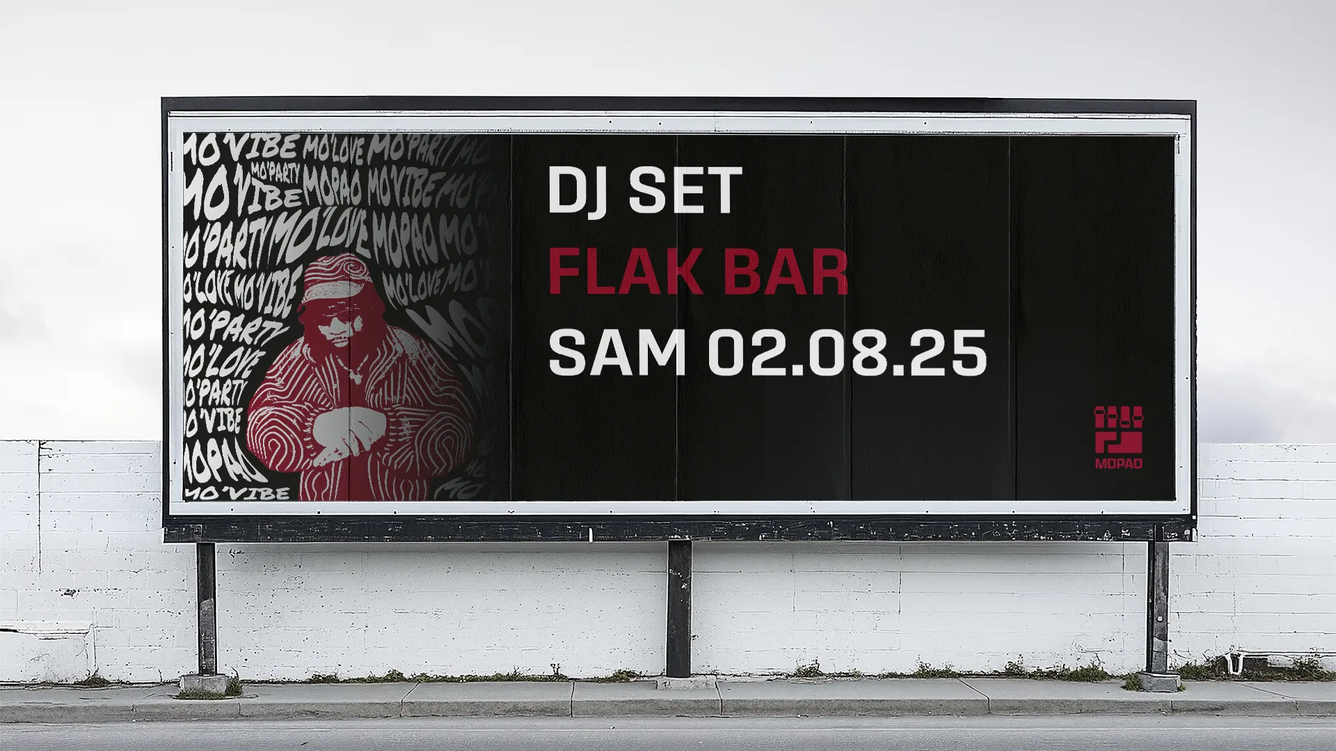
Logo Concept
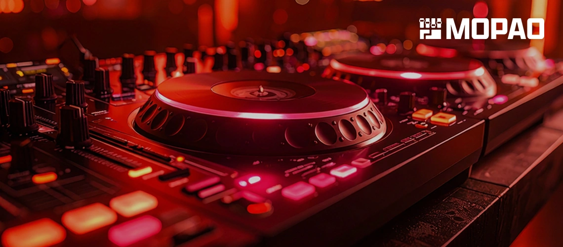
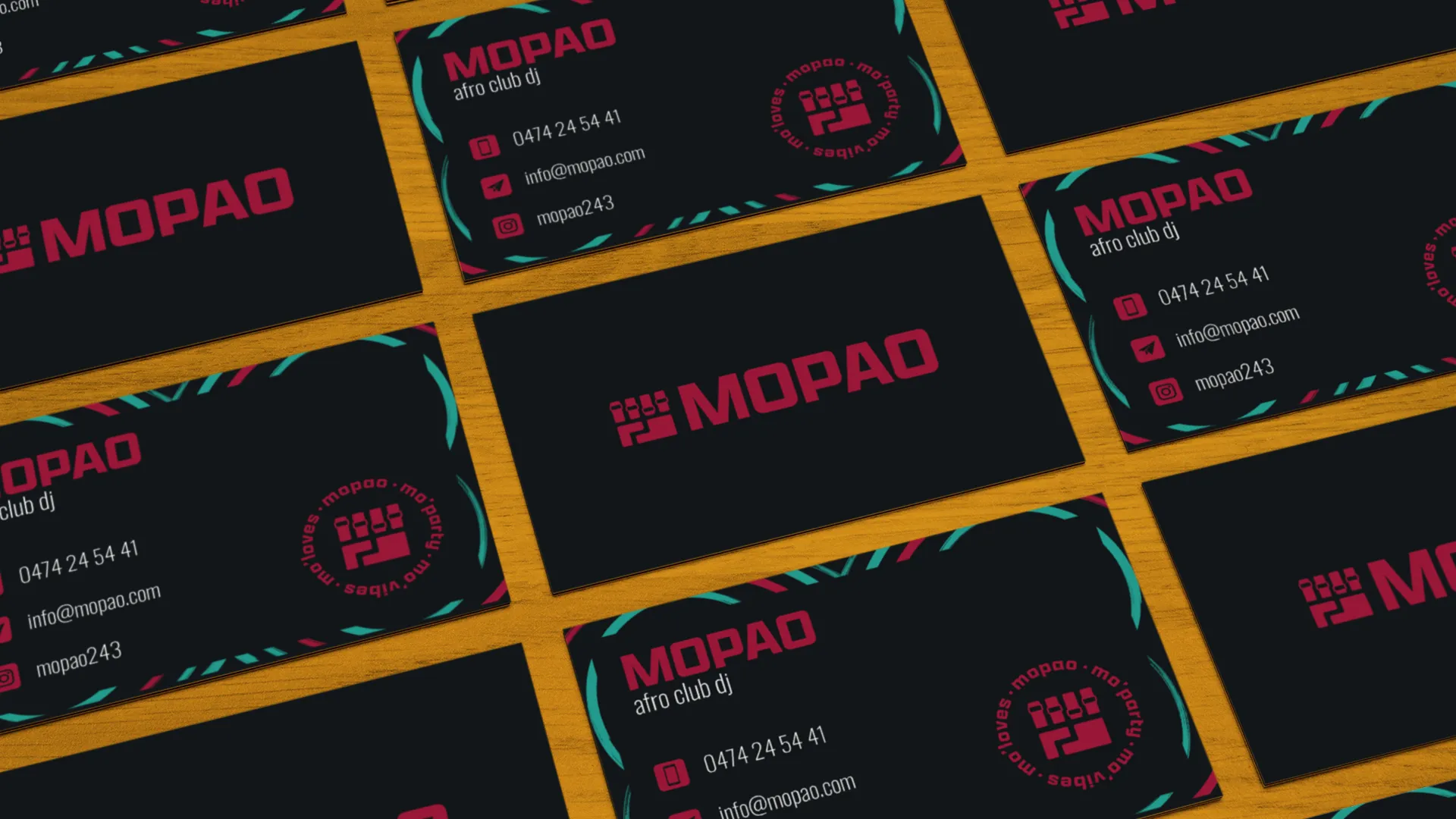
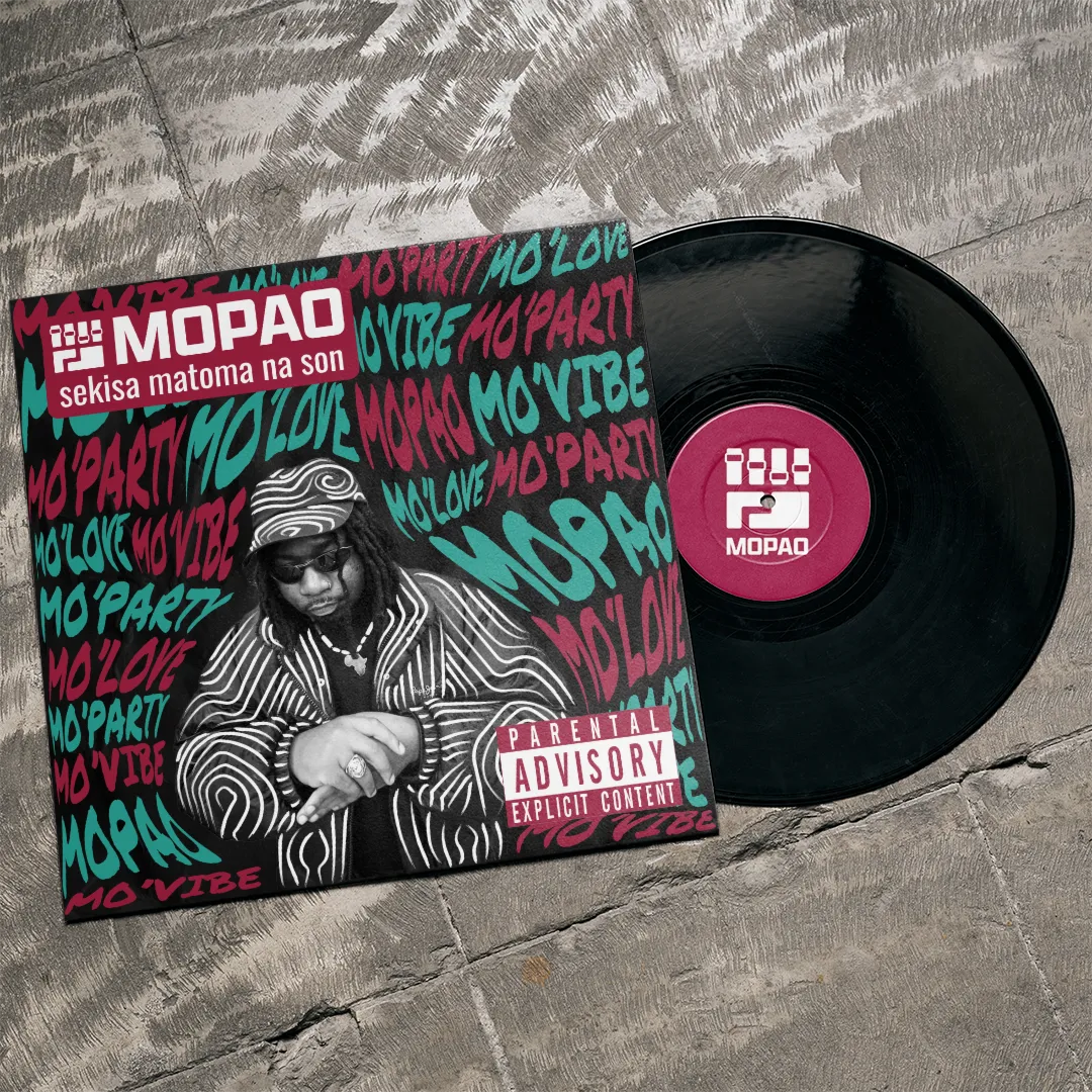
The logo I created is a powerful fusion of symbolism: it merges a raised fist — the universal symbol of liberation and social struggle, famously associated with the Black Panther movement — with a DJ controller or turntable fader. This dual reading connects Mopao’s music to a broader narrative of cultural resistance, identity reclamation, and creative empowerment through sound.
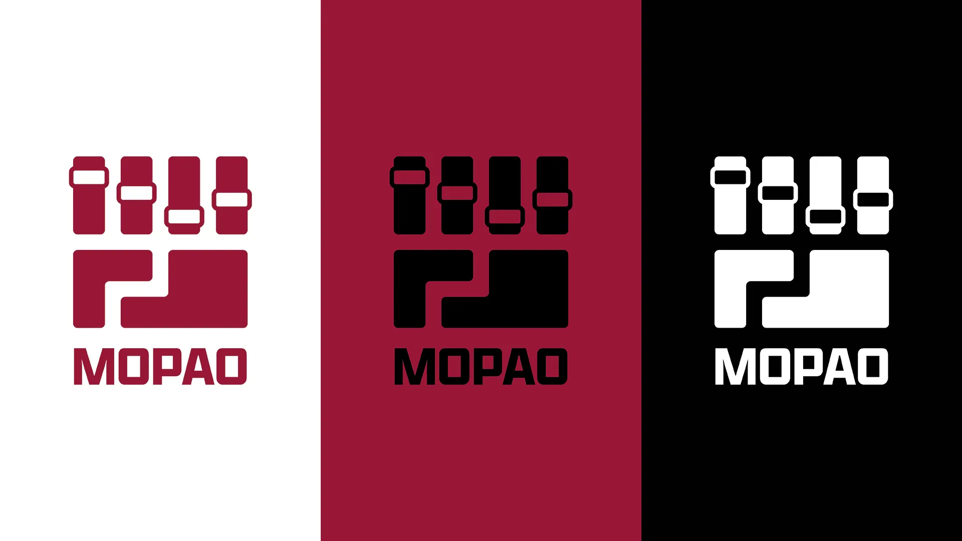
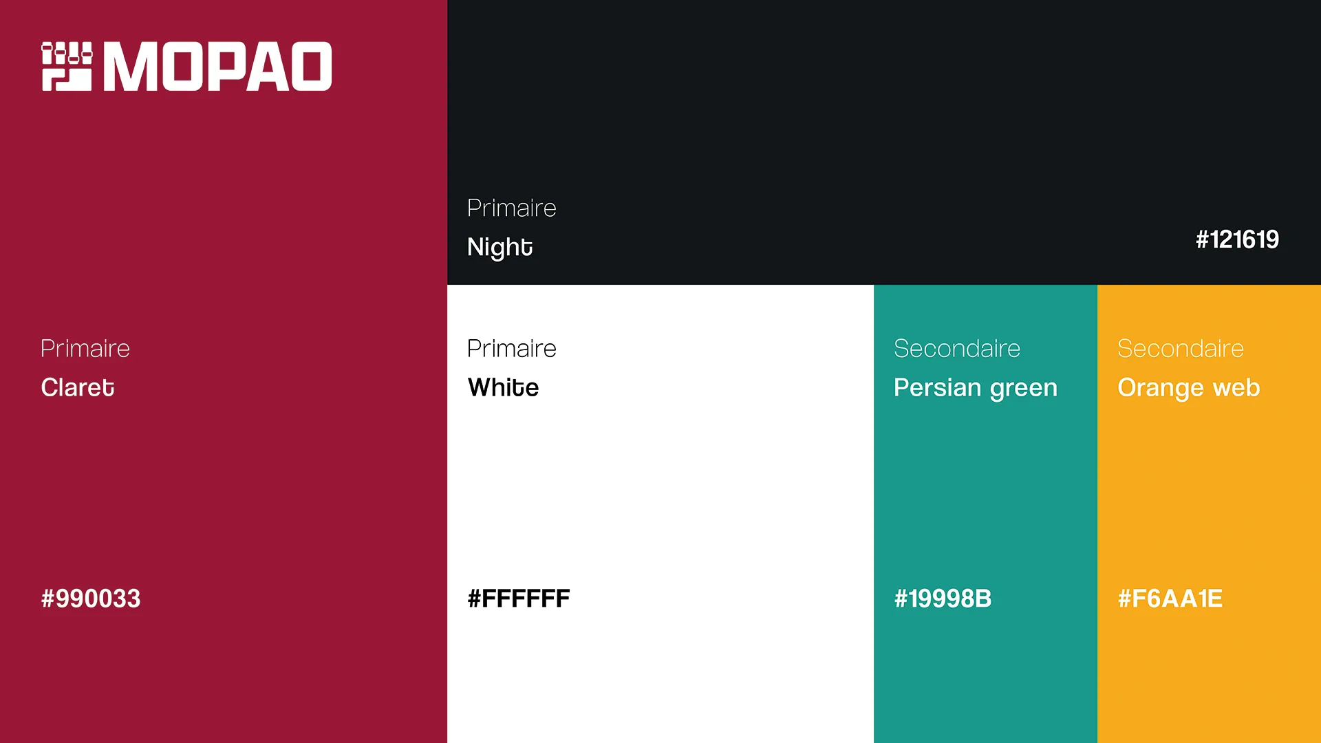
Color Palette & Pan-African Symbolism
For the color palette, I drew inspiration from 1980s-90s hip-hop groups that strongly embraced their African heritage and expressed a desire to create connections with their roots — artists like A Tribe Called Quest and Afrika Bambaataa. These pioneering acts frequently incorporated green, black, red, and yellow into their visual identities.
Originally, the colors of Pan-Africanism were green, yellow, and red, referencing the Ethiopian Empire. However, in 1920, the UNIA (Universal Negro Improvement Association and African Communities League) replaced yellow with black and created the red, black, and green flag, which carries profound symbolism:
- Red: The blood that unites all people of African descent, and the blood shed in the struggle for liberation.
- Black: The Black people as a nation, even without a corresponding state.
- Green: The abundance and richness of African nature.
This color system became the foundation of the brand identity, creating a visual bridge between historical Pan-African movements, hip-hop’s golden era, and contemporary afro club culture.
The Result
The brand identity positions Mopao at the intersection of heritage and innovation — deeply rooted in African culture while pushing the boundaries of contemporary electronic music. The visual system is both culturally resonant and strikingly modern, giving Mopao a distinctive presence in the afro club scene.
The result is an identity that doesn’t just represent a DJ — it represents a cultural statement, a connection to ancestral heritage, and a vision for where African diasporic music is heading. Every visual element carries meaning, creating a brand that is as thoughtful and layered as the music itself.