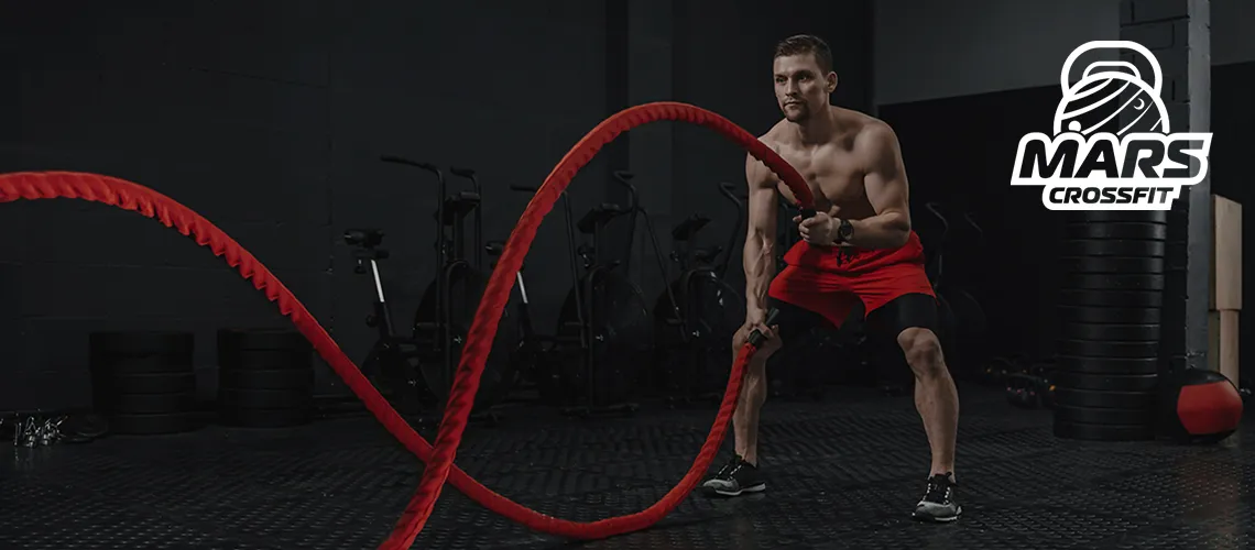
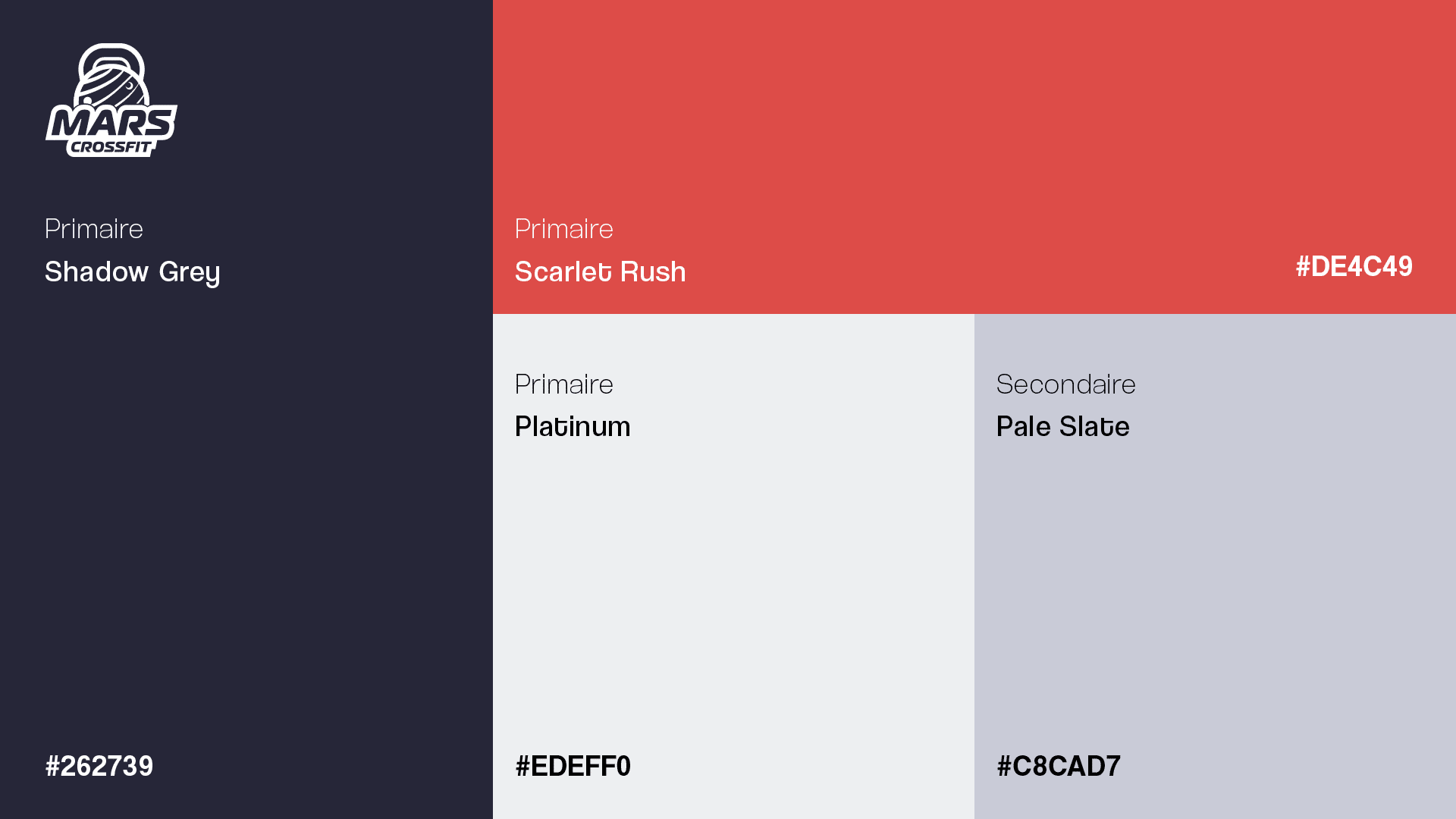
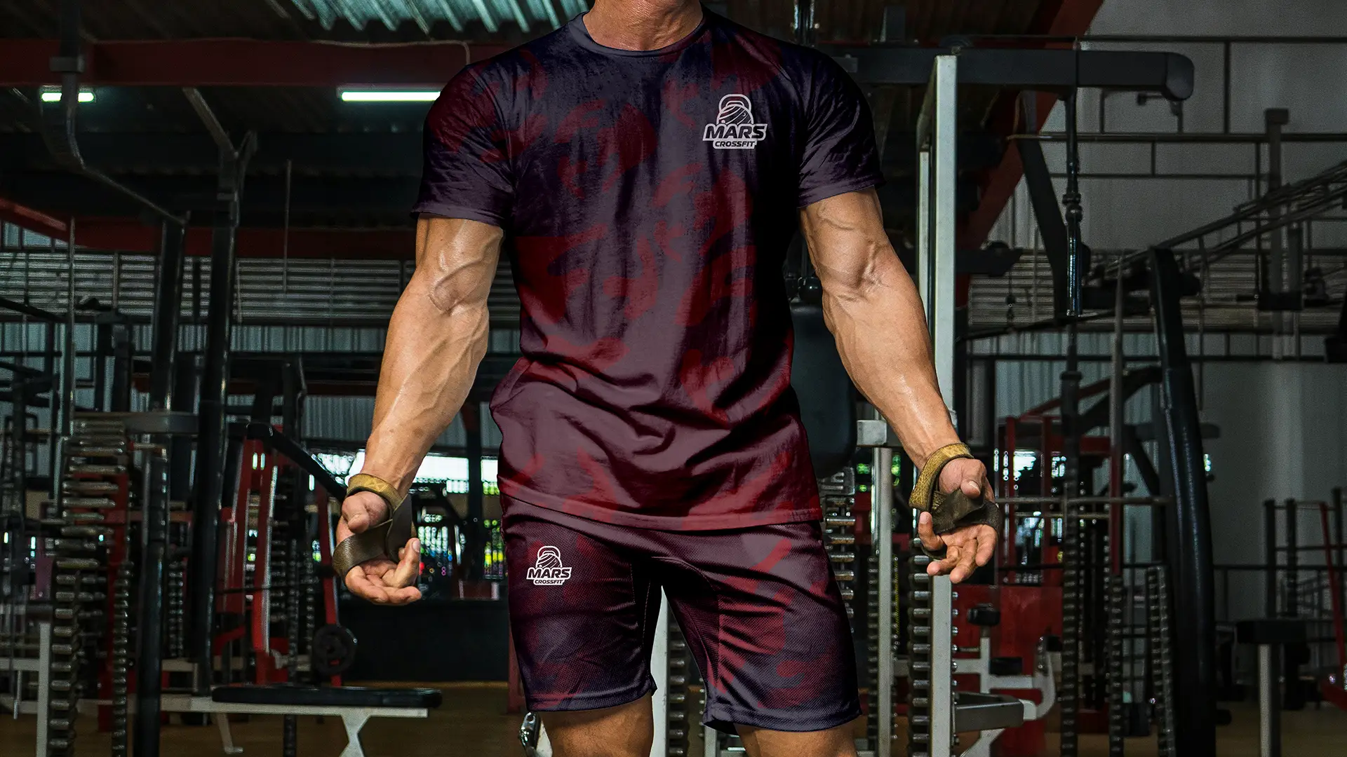
A CrossFit gym approached me to design a complete visual identity for their new brand. The client arrived with a name and a clear concept: Mars CrossFit, inspired by the Greek god of war — a powerful symbol of strength, discipline, and self-improvement that perfectly aligned with CrossFit’s philosophy of pushing physical and mental limits.
The Creative Process
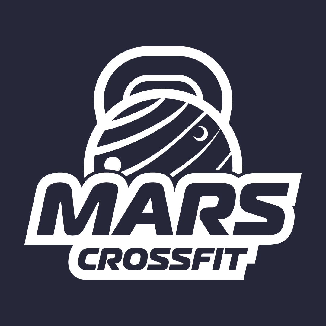
Rather than taking a literal approach to the mythology, my creative process led me to explore the deeper connections within the name itself. Mars is not only a Greek god — it is also a planet, and this dual meaning became the foundation of the entire identity.
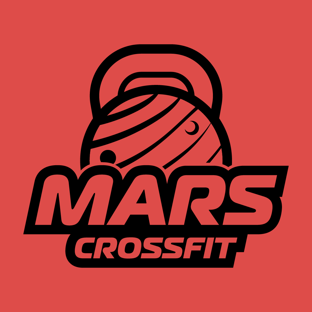
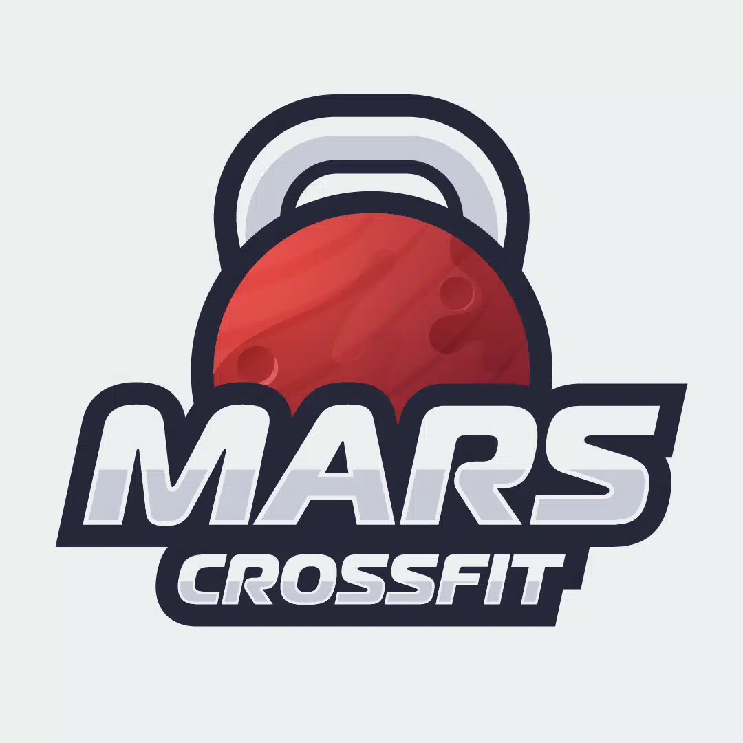
By bridging the mythological and astronomical dimensions of the name, I found a compelling visual opportunity: merging a kettlebell — the iconic symbol of CrossFit training — with the visual representation of the planet Mars. This fusion created a logo mark that is immediately recognizable to the CrossFit community while carrying a deeper symbolic meaning that reinforces the brand’s values of power, ambition, and elevation.
The Result
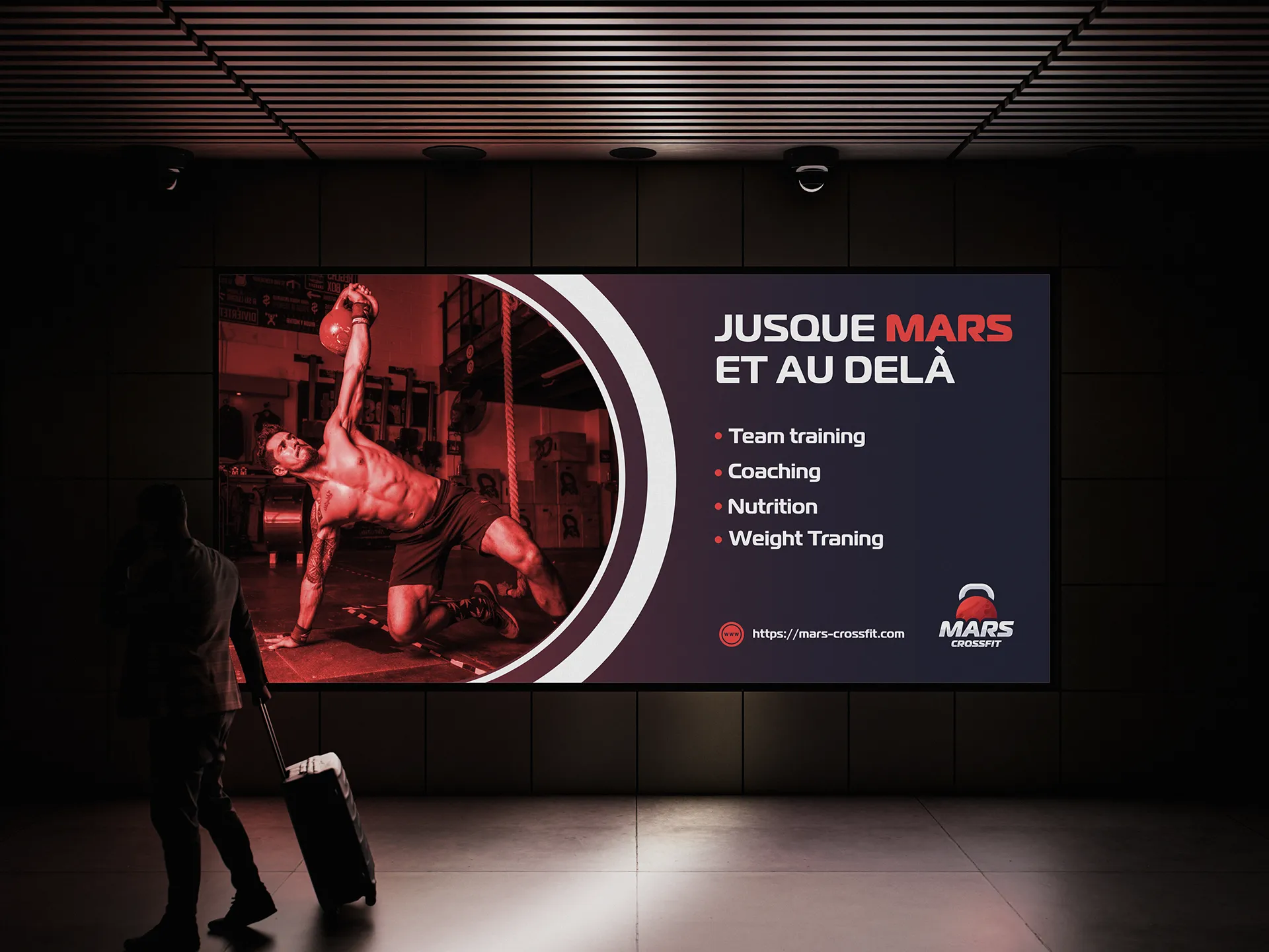
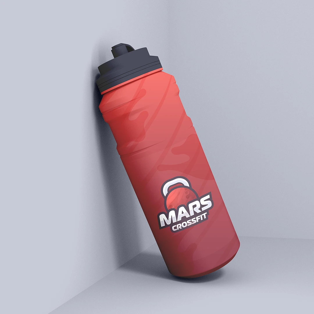
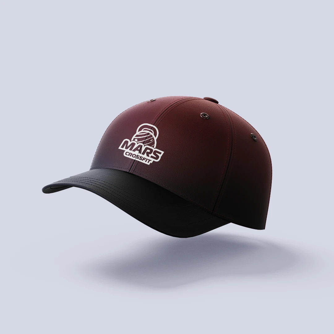
The outcome is a visual identity that goes beyond aesthetics. It tells a story, carries meaning, and gives Mars CrossFit a distinctive brand presence that stands out in a competitive fitness market. Every design decision was driven by the concept, ensuring a cohesive and intentional identity that resonates with athletes and embodies the spirit of the brand.