The Brief
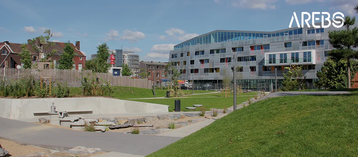
Founded in 1986 by the City of Seraing, AREBS is a municipal non-profit organization created to address the economic challenges facing the local steel industry. Since then, the association has focused its efforts on territorial development and improving employment opportunities in the region.
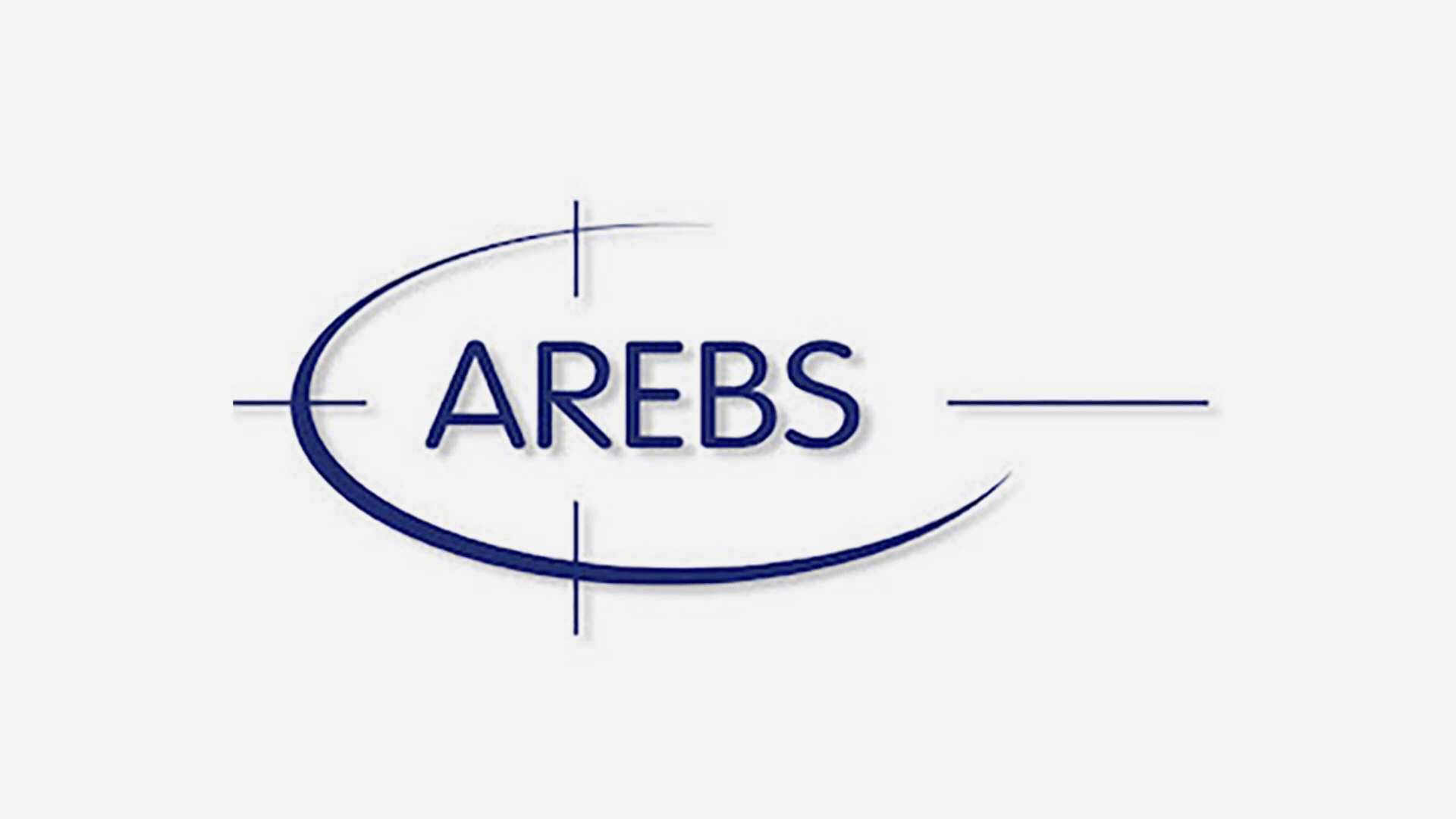
AREBS approached me with the mission of modernizing its graphic identity, starting with the redesign of its logo. The challenge was to honor the organization’s nearly four decades of history while positioning it for the future. The goal was to preserve the spirit of the original logo while giving it a modern, versatile touch that could be effectively adapted across various communication supports — both digital and print.
The Creative Process
My approach centered on evolution, not revolution. After nearly 40 years, the original logo carried significant brand equity and recognition within the Seraing community and among economic development stakeholders. A complete reinvention would risk losing this valuable connection.
I carefully analyzed the original identity, identifying the core visual elements that embodied AREBS’s mission and heritage. The redesign process focused on refining these elements — updating typography, simplifying forms, improving scalability, and ensuring the logo would perform across modern digital platforms while maintaining its effectiveness in traditional applications.
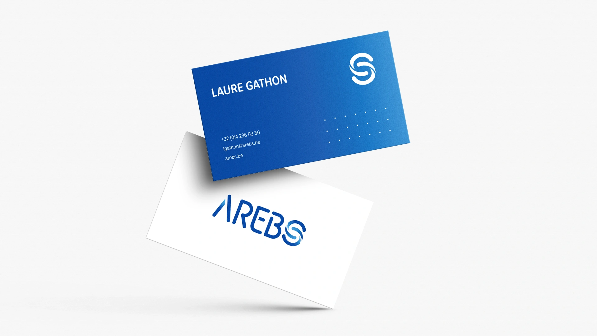
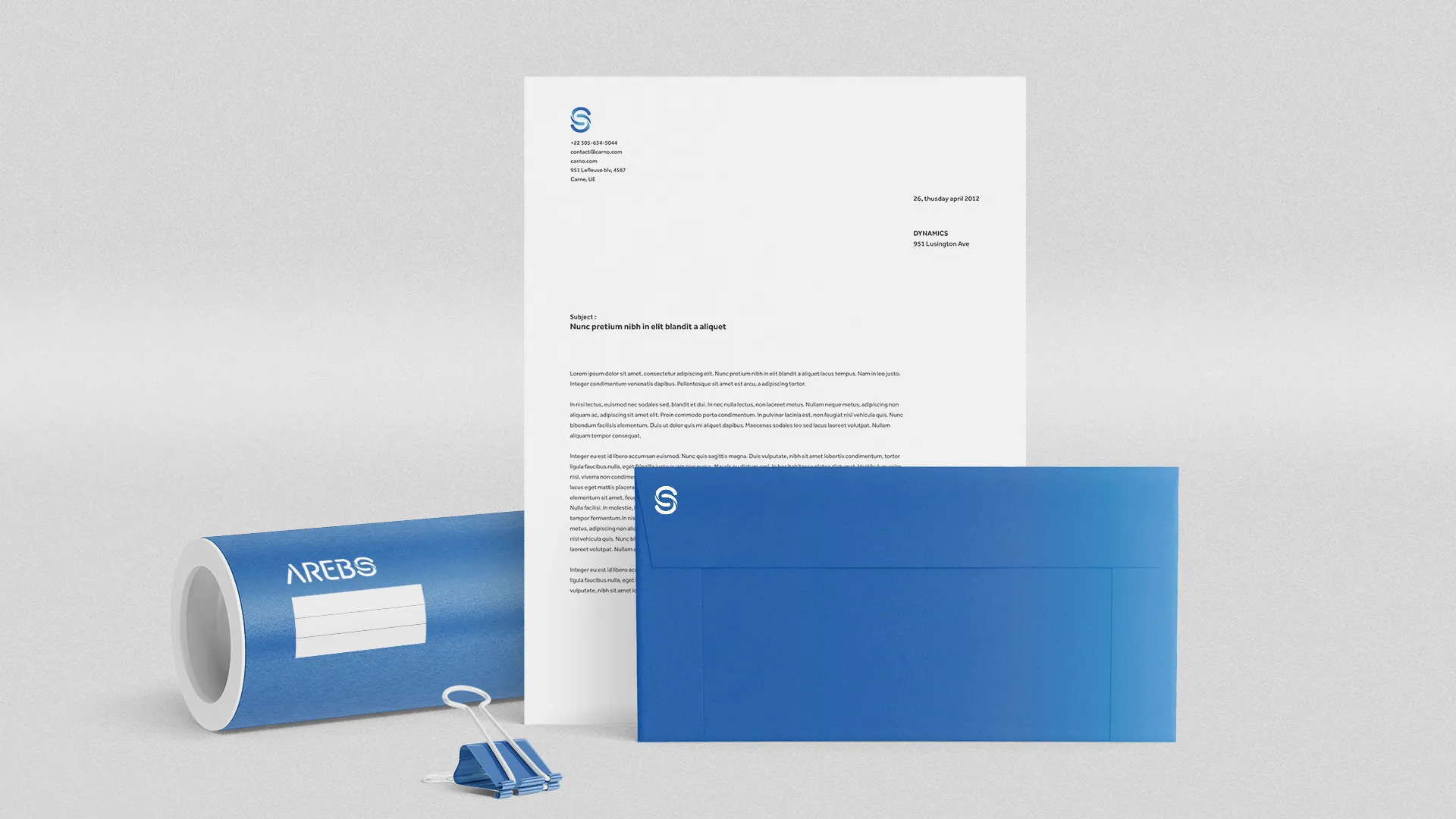
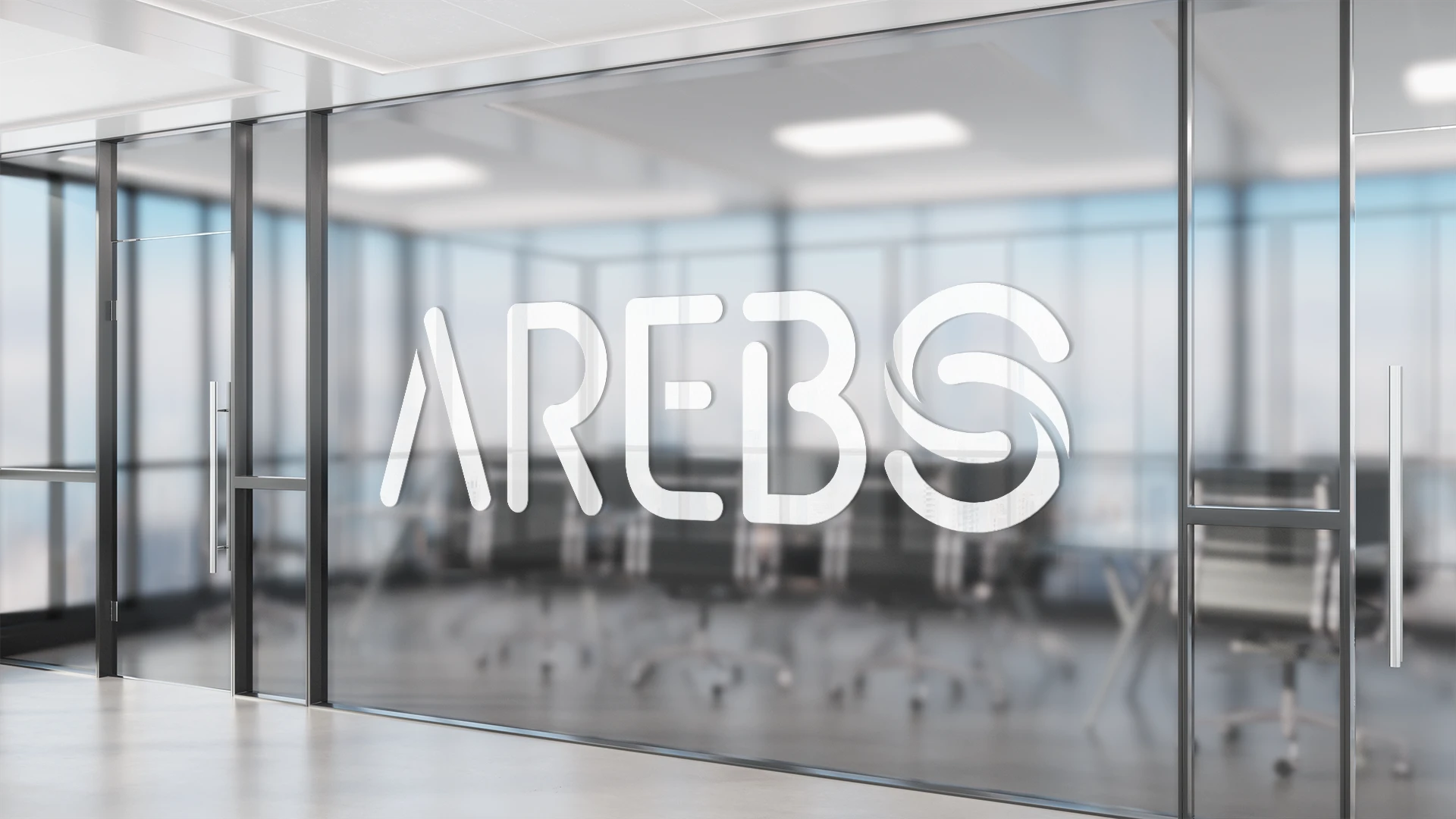
The modernization involved subtle but meaningful adjustments: cleaner lines, improved proportions, enhanced legibility at small sizes, and a color palette that feels both professional and contemporary. Every decision was made with versatility in mind, ensuring the logo would work equally well on a website, social media, printed reports, or large-scale signage.
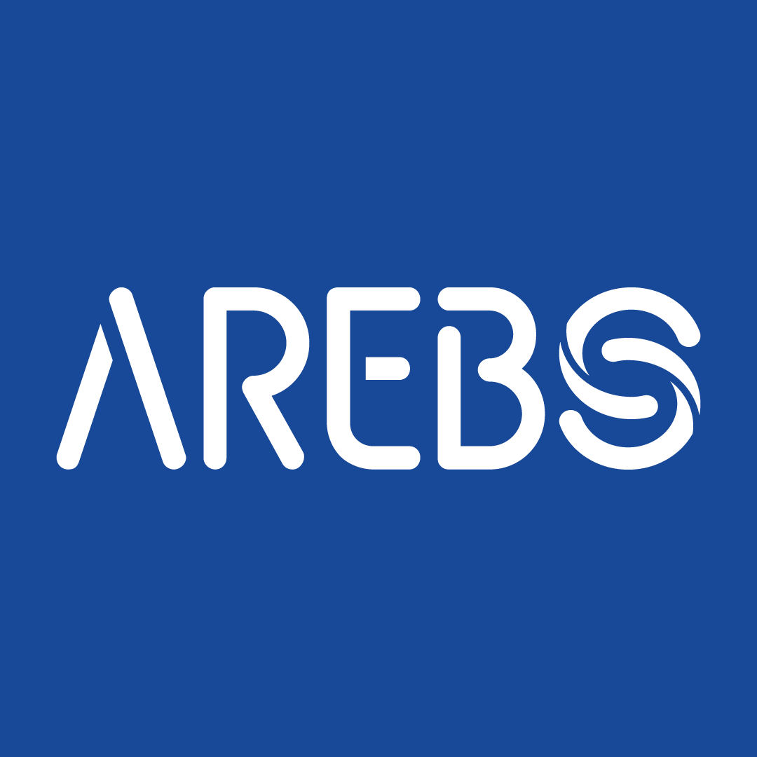
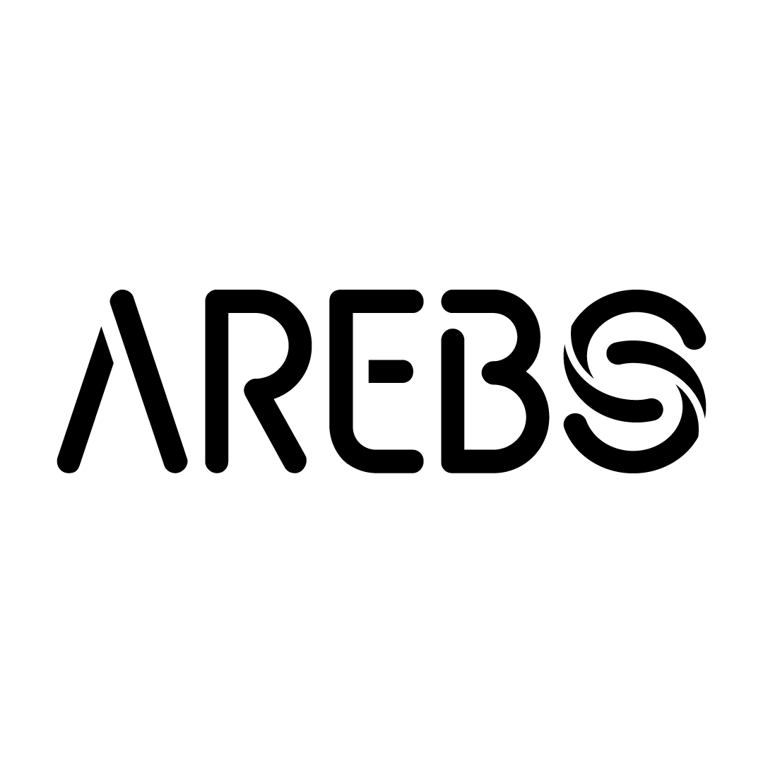
The Result
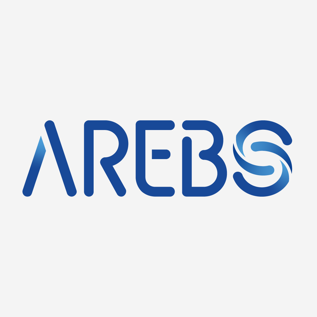
The refreshed identity gives AREBS a renewed visual presence that respects its history while projecting a forward-thinking, professional image. The logo successfully bridges the organization’s legacy in addressing industrial economic challenges with its contemporary role in territorial development and employment.
The result is a cohesive, adaptable brand identity that positions AREBS as both a trusted institution with deep local roots and a modern organization equipped to tackle today’s economic development challenges. The redesigned logo provides a strong foundation for consistent communication across all of AREBS’s activities and outreach efforts.